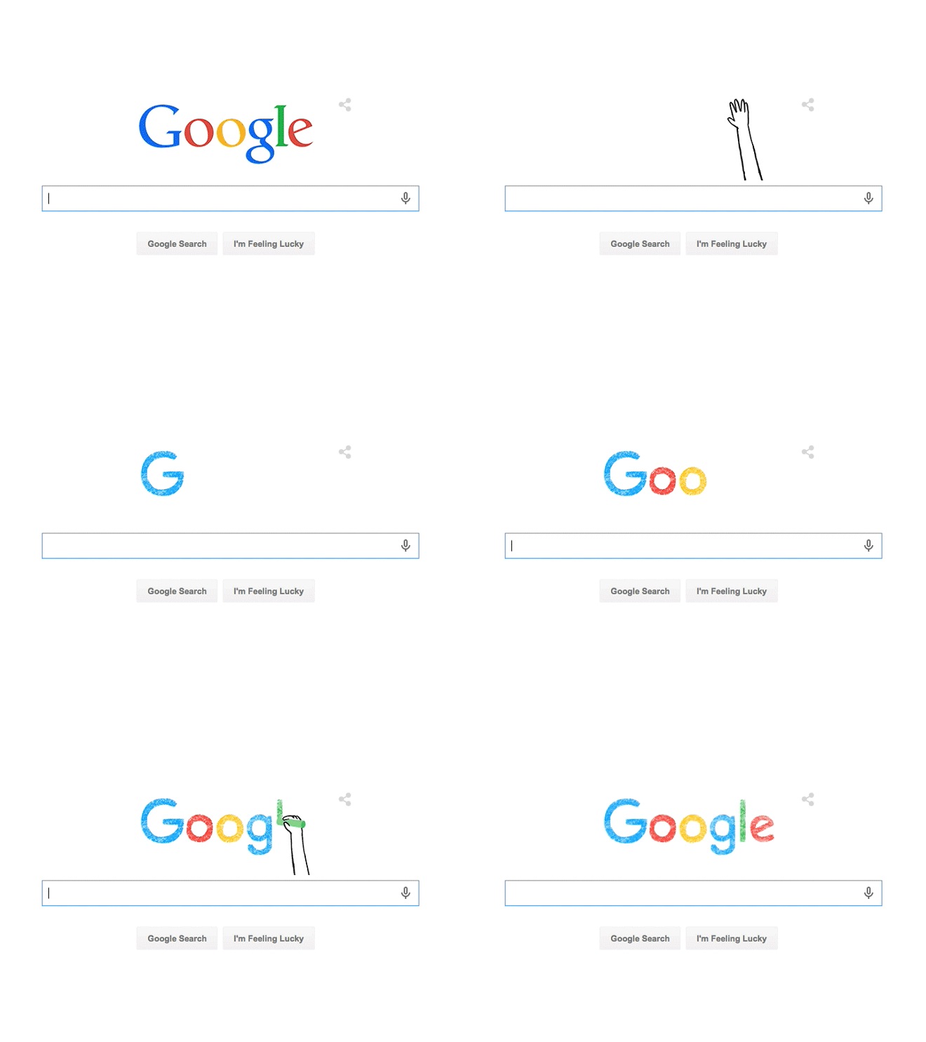
Google has come up with a new logo in wake of the move of creating Alphabet as a parent company. Google’s new logo ditches the old serif look and updating its image. The new logo looks a lot more modern and playful and bears a bit more resemblance to the logo of Google’s new parent company, Alphabet. This is the biggest change since 16 years as Google first cleanup up the lettering and settled on its four colors.
Google is also changing the tiny “g” logo that one sees on browser tabs. It is now an uppercase G with all of its four colors. The new design is already on the homepage with a cute animation and will soon be rolling out across all of its products. Google+ is now represented by a big colorless version of the new G.
In the official blog post announcing the change, Google discusses how much the technology has changed and how we interact with its products. Google is no longer a website on a desktop computer but is a huge collection of sites, apps and services that one can access from PCs, chromebooks, smartphones and anywhere you find a browser.
Google says its new logo “reflects this reality and shows you when the Google magic is working for you, even on the tiniest screens.” It says the revamped logo is simple, uncluttered, colorful, friendly and represents the best of Google.
Google says that it is also making some changes to the mobile search pages. The focus has been on swiping through results horizontally. Also, Google mobile app is getting a refresh and a few updates to how it presents Google Now Cards.
What are your views about Google’s new logo? Do you like it? Share your thoughts with us in the comments!
If you like our content, please consider sharing, leaving a comment or subscribing to our RSS feed to have future posts delivered to your feed reader.
Please follow us on twitter @CodeRewind and like us on facebook


