Popular web browser company, Opera, has unveiled its new logo and brand identity. Over the years, Opera has significantly evolved its user-base and services. It serves more than 350 million internet users a month and the company has also reported that 1.1 billion users have accessed content provided y the company via Opera Mediaworks. It is a subsidiary advertising division of Opera.
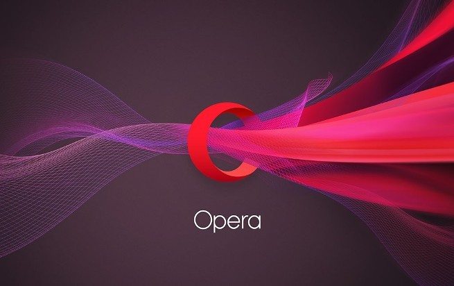
With Opera’s new logo, it looks and feel aims to further recognize the capabilities of this web browser. The company has gone through a major change in its logo as compared to its logo in 1995. The change is the reflection of what Opera is all about. The new ‘O’ is three-dimensional which the company claims to symbolize a gateway to lead towards more content, more answers etc. There’s a whole new 3D effects that leads to an expanse of content provided by Opera.
Opera is no longer just a browser and they envision themselves as enablers to give you access to content, answers, fun and other online experiences. This is the reason they got rid of the word “Software” in their logo.
It will take some time by Opera to spread its branding all over the web. The new logo and brand identity is based on the new ‘Do More’ philosophy of the company.
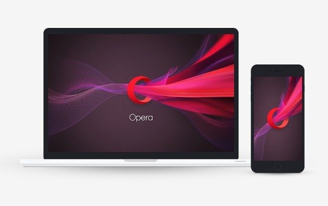
The new icon is soon coming to Opera Mini for iOS and Windows Phone. Also, their Opera Mediaworks is also adopting the new design. The rest of Opera’s family apps will be upgraded to Opera’s new logo in next few months including Opera for Android, Opera Mini for Android and Opera for PC.
To recall, Google changed its logo recently.
What do you guys think about Opera’s new logo and branding? Share your views in the comments!
If you like our content, please consider sharing, leaving a comment or subscribing to our RSS feed to have future posts delivered to your feed reader.
Please follow us on twitter @CodeRewind and like us on facebook

